
Area under the curve (AUC or c-statistic) is not paramount. Shape often matters more.
New and expanded whitepaper link
Also read “Subtlety of ROC AUCs (C-statistics) that is Often Forgotten”
What is the issue?
It boils down to the clinical use of a particular diagnostic. This is not represented by the area under the curve (AUC), or c-statistic. It is determine by the shape of the curve.
There are other nuances as well.
To begin with, the AUC is only a rough guide of what’s good, and for the most part predominantly useful in comparing curves of the same contour. The bigger the area, for one of a group of curves with the same profile, the better. However, curve shape matters. A lot.
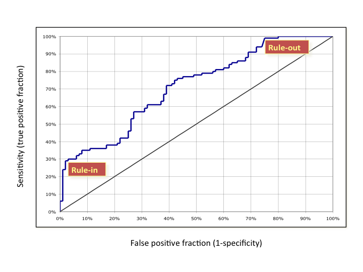
As can be seen in the figure below, a steep shape at the bottom near the y-axis (high-specificity or low false positive fraction) is best for rule in. The patient has the disease. Likewise, a shallow, asymptotic shape at the top, with very high sensitivity, is best for rule out as not having the disease. So, curves that are big at the top, or bottom, are generally more clinically useful than those that are big in the middle. Many (most?) curves are big in the middle.* In contrast, the skewed shapes have a more straightforward clinical value. This can be so, even if the AUC is lower for the skewed curve than a more well rounded shape.
* There are exceptions, for outstanding assays, like troponin for heart attack, or CCP for rheumatoid arthritis.

What are the implications?
For one thing, the idea that the optimal cut-off for an ROC curve is at the 45 slope inflection is incongruous. The cut-off should be set clinically, based on the treatment algorithm, the risks of false negatives, and the costs and risks of false positives. In fact, for a curve such as the one below (real, disguised data), two cut offs would be appropriate, and the diagnosis of patients between them indeterminate.
What does this mean practically?
Lately, ROC analysis is being used a lot for biomarker discovery, multi-marker indexes (FDA termed IVD MIAs), and the like. Differences in areas under the curves (help) drive selection of the markers. Often, lists of biomarkers or algorithms are merely ranked by AUCs (c-statistics) as a screen—high good, low bad. Of course, if too many biomarkers are being assayed against too few patient samples, this traditional use of ROCs, breaks down even more (so called false discovery, a topic for another day).
It goes without saying, that before this kind of analysis comparing biomarker performance, one should understand the clinical issues and fit for the diagnostic. With this understanding, trade offs between false positives and negatives, sensitivity versus specificity, or importance of positive or negative predictive value can be reasoned. That shows where on the curve one should be, and what contour can work best. The clinically valuable biomarker, and its ROC, may appear quite middling in the normally used stats, but be the most useful.
So it’s time to slog it out. Look at and compare the shapes. For those that appear useful and similar in profile, the AUC is the right tool, and a great tool, for selecting the best biomarker(s). Use it then.
© 2019 Winton Gibbons

[…] a threshold, you want to know where the steepest and flattest parts of the curve start and stop. As the source of the above picture states, curve A is good for ruling in a disease. This is because you want low false positives, and […]
LikeLike
[…] another commentary, the importance of shape of an ROC curve, rather than area under the curve (AUC), was highlighted. That topic is very rarely if ever […]
LikeLike
I agree that multi-variate tests (or sequential tests) may look better than the individual tests’ AUROCs would indicate. Often, a multi-variate index can be created and the ROC for that index determined (as well as sensitivity, etc.). Also, your points about predictive values are well taken. They illustrate one of the values of a good prospective study – prevalences observed are estimates of those in the intended population.
LikeLike
[…] A Myth about ROC Curves and C-statistics […]
LikeLike
Two comments. First, no matter the shape, if the AUROC is too small, the test is unlikely to be useful (Rule-out the test instead of using it to rule-out disease). Second, in cases such as your example, partial areas under the curve may be useful.
LikeLike
Paul – For the most part, I agree. For your first point, the only attitudinal data that I’ve seen and generated, was for cancer recurrence, broadly speaking. In that context, even with very high specificity, a sensitivity of greater than 1/3 was needed for physicians to believe they will use the test. However, prevalence, positive predictive value (PPV), and public perception and policy also go into the equation. For example, in mammography screening for breast cancer, a PPV of 10% has been considered sufficient (although now a great point of controversy).
LikeLike
Paul – Agreed on your points, but only partially on the first. Having been involved in a number of multi-marker programs, and for heterogeneous diseases, I have seen the baby most often thrown out with the bath water, in search of even middling AUCs. Putting together a number of low AUC, but properly shaped curves, has led to better results. Great biomarkers have both, (e.g., troponin, CCP), but for too many instances, those type of biomarkers have not yet been found. So, one must find the best way to cobble together more than one biomarker.
LikeLike